
Choosing the right colour for your home is an essential decision that can impact the overall look and feel of your space. However, with so many options available, it can be challenging to know where to begin. In this article, we will provide you with expert tips and tricks on how to choose the perfect colour scheme for your home. From understanding the psychology of colour to identifying the right colour combinations, we will cover everything you need to know to create a beautiful and cohesive space.
- The Psychology of Colour
- Identifying Your Colour Preferences
- Choosing the Right Colour Scheme for Your Home
- The Impact of Lighting on Colour
- Using Colour to Define Spaces
THE PSYCHOLOGY OF COLOUR
The Psychology of Colour is an important consideration when choosing the right colour for your home. It is the study of how colour affects human behaviour and emotions. Understanding the basics of colour theory is essential to creating a harmonious and inviting space.
Colour Theory 101: Understanding the Basics
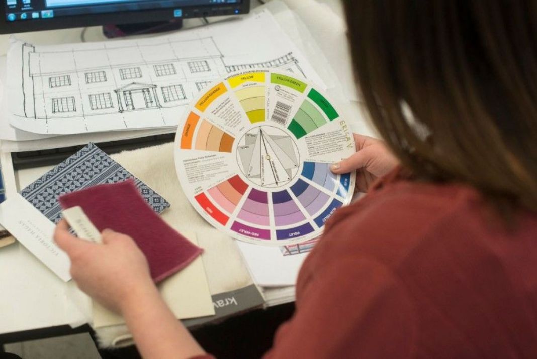
The colour wheel is a visual representation of the relationships between different colours. It is made up of primary hues (red, yellow, and blue), secondary (orange, green, and purple), and tertiary (yellow-green, blue-green, blue-purple, etc.). Understanding colour families and undertones is important when selecting paint colours for your home.
How Colour Can Affect Your Mood and Emotions
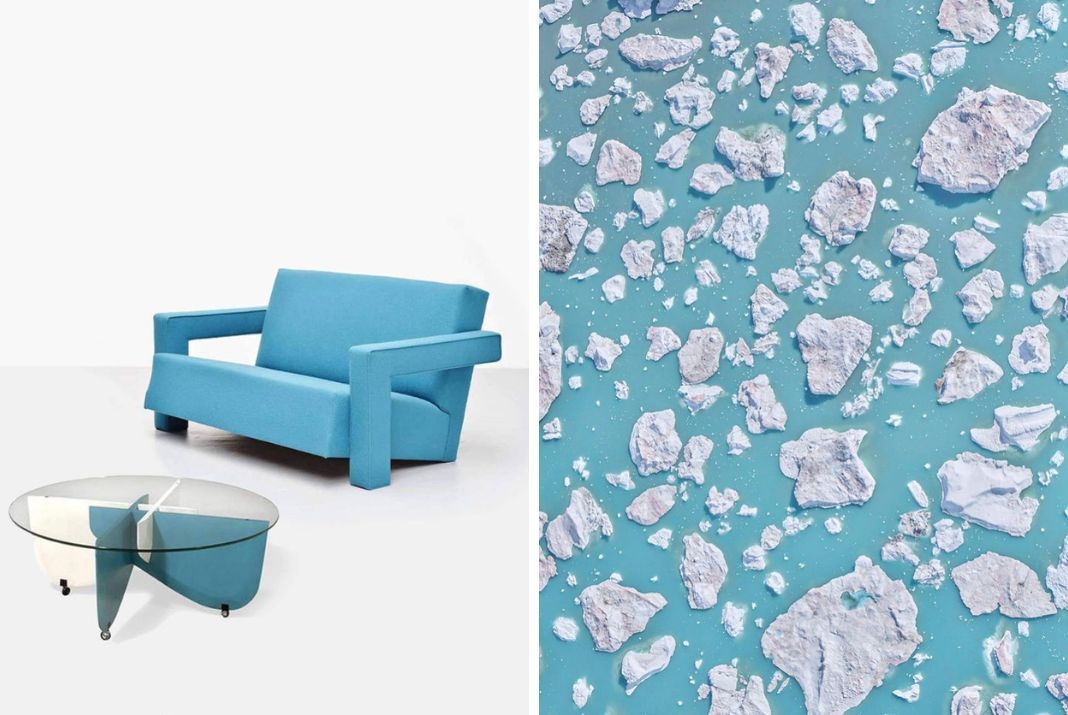
Colours can evoke different emotions and moods. For example, warm hues like red, orange, and yellow can create a cosy and inviting atmosphere. Cool colours like blue, green, and purple can create a calming and relaxing space. Bright colours like pink, yellow, and orange can add energy and vibrancy to a room.
Choosing Colours Based on the Room's Function
The function of a room should also be considered when choosing a colour scheme. For example, blue is often used in bedrooms and bathrooms because it is calming and relaxing. Yellow is often used in kitchens and dining rooms because it is associated with happiness and warmth. Green is often used in home offices and study areas because it promotes concentration and creativity.
IDENTIFYING YOUR COLOUR
Identifying Your Colour Preferences is an important first step in choosing the right colours for your home. Everyone has different colour preferences and it's important to choose colours that you love and that make you feel comfortable in your space.
Exploring your Style
Exploring Your Style is another important factor to consider. Do you prefer a traditional or modern look? Are you drawn to bold colours or more muted tones? Understanding your style can help you choose a colour scheme that reflects your taste.
Use Colour Palettes to Create a Cohesive Look
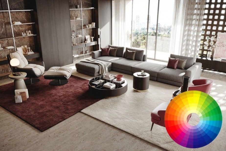
When choosing a colour palette, it's important to consider the colours of existing furniture and decor in the room, as well as the overall mood and ambience you want to create.
CHOOSING THE RIGHT COLOUR SCHEME FOR YOUR PROJECT
The colour scheme you choose can set the tone for the entire space and can influence the mood and emotions of those who inhabit it.
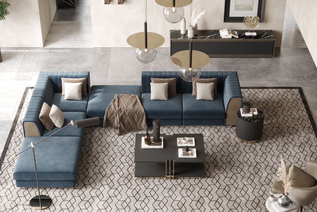
Monochromatic Colour Schemes: Uses varying shades and tints of a single hue. For example, a room may feature shades of blue, ranging from light blue to navy blue.
Pros:
- A monochromatic colour scheme can create a soothing atmosphere.
- It can be easy to create a cohesive and harmonious look since all the colours come from the same hue.
- It can make a space appear larger and more spacious.
Cons:
- A monochromatic colour scheme can sometimes lack visual interest and variety.
- It can be challenging to create contrast and depth in a monochromatic room, which can make it appear flat and lifeless.
- It may be difficult to find decor and accessories that match the specific shade or tint of the chosen colour.
Complementary Colour Schemes: Uses colours that are opposite each other on the colour wheel. For example, a room may feature blue and orange, or red and green.
Pros:
- A complementary colour scheme can create a vibrant and dynamic atmosphere.
- It can provide a lot of visual interest and contrast, which can make a space feel lively and exciting.
- It can be easy to add accents and decor in the opposite colour to create balance and harmony.
Cons:
- A complementary colour scheme can sometimes feel too bold or overwhelming.
- It can be challenging to find the right balance between the two colours, as they can clash if used in equal amounts.
- It may be difficult to find decor and accessories that match the specific shades of the chosen colours.
Analogous Colour Schemes: Uses colours that are adjacent to each other on the colour wheel. For example, a room may feature shades of green and yellow, or shades of blue and purple.
Pros:
- An analogous colour scheme can create a harmonious and cohesive atmosphere.
- It can provide a lot of visual interest and variety, while still maintaining a sense of unity.
- It can be easy to add accents and decor in a complementary colour to create contrast and interest.
Cons:
- An analogous colour scheme can sometimes lack the boldness and excitement of other colour schemes.
- It can be challenging to create enough contrast between the colours to prevent the space from feeling dull or boring.
- It may be difficult to find decor and accessories that match the specific shades of the chosen colours.

THE IMPACT OF LIGHTING ON COLOUR
The impact of lighting on colour is significant and can be affected by various factors. Temperature can affect how warm or cool a colour appears, while a high colour rendering index can accurately reproduce colours. The direction of light can create shadows and highlights, enhancing depth and contrast, while diffuse light can make colours appear softer.
The intensity of light can affect colour perception. These factors should be considered when selecting lighting for a space to ensure that colours are accurately represented and enhance the overall aesthetic.
By understanding the psychology of colour, identifying your colour preferences, and choosing the right colour scheme, you can create a beautiful and cohesive space that reflects your style. Remember to consider the impact of lighting and choose the right paint finish for your project. By following these expert tips and tricks, you can create a space that you will love for years to come.